This last weekend I had the pleasure of attending Becka Rahn's Spoonflower Master Class, Vectors Beyond the Book. This was located at
Spoonflower HQ in Durham, NC. The class was an amazing opportunity for me to learn more about vector design from a great teacher and to gain some insight into the workings at Spoonflower.
First I am going to talk about the class and then I will get into some details and answer some questions I know I had about Spoonflower's printing process and other helpful information for spoonflower designers and anyone looking to purchase or design spoonflower fabric.
I was crazy nervous about the class, was I going to know enough, would my nervous laughter make people laugh at me, and all the other "what if's" I had floating around in my head. My roomate Cindy and I both flew in a day early due to flight schedules from the west coast. We had Friday morning before class started to explore the area on our own and we chose the Vasher Museum of Art on the Duke campus. We found that we got along really well and had fun examining art and thinking of
 |
| A tiny section of art at the Vasher Art Museum. |
different views of the art as it might pertain to fabric design. When we arrived at Spoonflower we were surprised that it wasn't a huge building, it only takes up part of an office building complex. I had envisioned a huge factory type setting I guess, lol. Friday evening was introductions, and meet and greet with Stephen Fraser. Again more with that later. We started out with a fun project of making animals out of simple shapes. I wasn't sure where this was headed

and whether or not maybe I was more advanced than I should be for the class.
 |
| Working on our Animals |


The next day we received our animals that we had made and that were scanned onto a usb drive. Becka went into detail about vectors and rasters and helped everyone understand how that played into fabric design as well as went over all the basic tools for illustrator we would be using. Now the real work started as we learned how to effectively use the trace feature to make our black/white animal a vector design. I learned some great tips and tricks for effectively using the trace feature. Once we had our animal (mine was a bird) set up how we wanted, we set them aside and started working on some repeating backgrounds that Becka had ready for us. We just picked one that we wanted to use with our animal and then got to play with the design colors. Since my bird was a bit whimsical, I went with different sized circles. Then we had to add our animal to the background and get it set up how we wanted it printed. We didn't have a lot of time to be fussy with it as our design would be going to the printers ASAP. It was a little like a reality show contest as everyone rushed to finish their designs.

Made it, whew, now it was lunch. We could hardly wait for lunch to get over so we could do the tour of Spoonflower! Tour time, we even got to see
Roostery and
Sprout,everything was amazing! Employee's love working there, learned a ton about the printing process, saw all the printers in action and were in love with the beautiful spoonflower covered furniture :)After our tour we found out that our fabric that we designed that morning would be going through the printers and we would be able to watch. For everyone there it was amazing. Like giving birth to a creative part of yourself! We then started from a photograph and learned how to use the pen tool to create an outline of our photo that we would use in a silhouette design for a hankie design we were working on.
 |
| This silhouette was pen traced from a photograph of my Mustang Sammy. |
I have used the pen tool before but normally worked with the pencil tool because I thought the pen tool wouldn't give a rounded feel to the corners and object. I soon found that the pen worked so much better than pencil and was much more editable. I am so excited to have learned this! Seriously! We left early from class to have dinner in downtown Durham where the wonderful Meredith got us set up with some good BBQ and then we walked around seeing the sights. Now for picture overload!

 |
| Sprout Patterns |
 |
| Wallpaper |
 |
| Roostery |
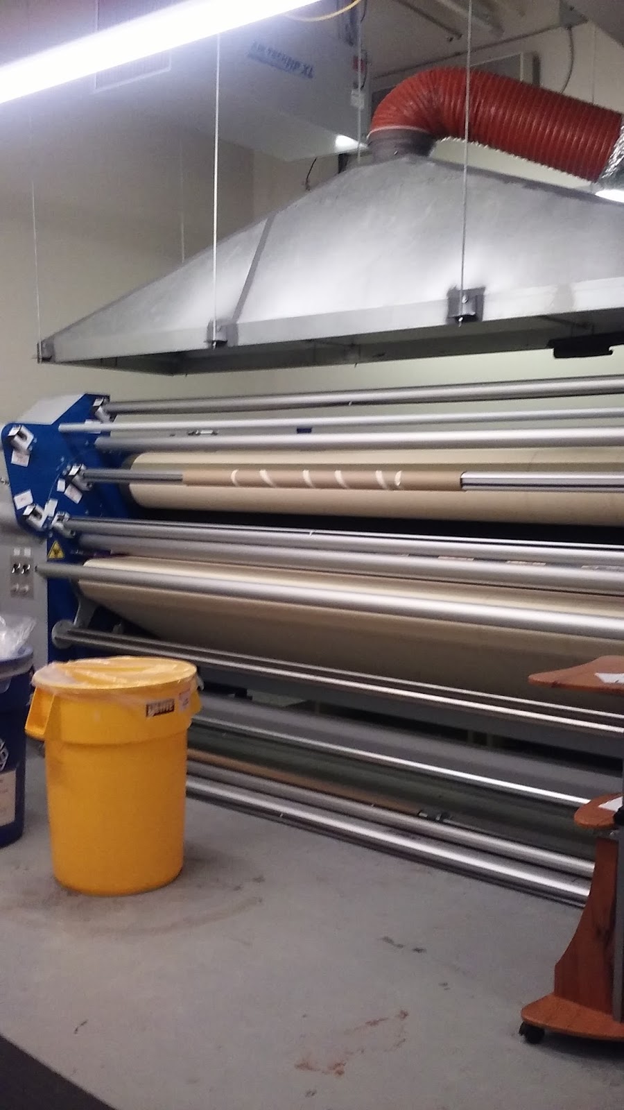
 |
| Our fabrics being printed. |
Sunday we got our fabric back that we designed. We went over them looking to see how they printed if there were any errors and so on. I had a little speck on mine, which I must have initially thought was a speck on my screen. Turned out to be a little line segment I hadn't got erased, lol. We all learned about the importance of getting swatches of the fabric. Mine definitely printed differently than it appeared on my screen, as was the case for most of the others. So having the color chart printed is a must have if you really want to know how it prints.
 |
A rough sketch of a damask
design I like. |
 |
| Flight Home |
 |
| The pattern I designed for the beak! |
Designing patterns was next on the agenda, and we learned a lot in a small amount of time. I love the new version of illustrator for the pattern tool! I have been using an old version and it was not fun. We also had one on one time with Becka. I spoke with her to see what her thoughts on a damask design for my new bedroom were. The design pictured here is just a rough sketch and I want to add some paisley swirls in as well, as it progresses. She confirmed the direction I was heading was good and I was happy that I was doing things right. Sunday evening things wrapped up and we said our goodbyes. I was sad it was over but thrilled with the new information and confidence I gained during the class. Becka is amazing and encouraging! If you ever get the chance to take a class from her I would highly recommend it. You can go to her website at
www.beckarahn.com to see what she has going on.
REWIND
Ok so back to the technical info I know many of you have been curious about. I will start with talking to Stephen. I was extremely impressed how interested he was in all of our questions and asked our opinions on several items including a possible 2nd book. One of the biggest questions people I know have had was about the contests. I have seen many people who were very frustrated when they dropped the weekly contests that had been running since the beginning of time...ok not really but the beginning of spoonflower. One reason was that it was simply that, a need for change after so long doing weekly contests. The time involved with the contests for spoonflower on a weekly basis was a lot. They also felt that a monthly contest would allow them to offer greater prizes. And last but not least the traffic to spoonflower from the contests was no longer increasing and hadn't been for quite some time. He asked for my input and suggestions and welcomes any others that people may have. Humans are creatures of habit, we all got used to the weekly contests and it may take some time to get used to it, but I feel it is all for the best and that Spoonflower is truly trying to make things better for everyone. Change is good folks!
Next up I am going to talk about some things I learned regarding the actually printing on the fabric and why it is so important for both the designer and the purchaser to order swatches. If you get nothing else from this post please ORDER SWATCHES! Now for the finer details on this. Spoonflower has many fabrics, both organic (linen and cotton) and non organic (ie polyester). Here is where I wish I had recorded the whole fabrics tour so I could look back at the exact terminology but I will give it to you in easy to understand terms the best I can. We will start with the organic fibers, such as cotton and linen. These fabrics are printed on in a manner much like an ink jet printer and then heat set. The ink only penetrates and is absorbed so much. Now the polyester fabrics are a much different story. The design is printed in reverse on a special paper which is sandwiched together and transferred that way to the fabric then it goes through a heat setting machine in which the fibers expand and the ink vaporizes and is absorbed by the fibers. Yes the ink vaporizes and becomes one with the fibers and once these fibers cool the colors are locked in. So if you can visualize that you can see why the poly fabric are so much more vibrant and fade resistant. Organic fibers just do not have the same properties and ability for the color locking like polyester fabrics. If you ever have a chance to take a class there or take a tour I would highly recommend it. The how to of the printing was fascinating! Again, I am not good with the technical terms used, but this is the jist of the printing and the differences between the organic and non-organic fabrics. I also had a question on safety and flammability which can be answered
here. With talking to them they are always on the lookout for the best, safest, most environmentally friendly printing methods they can. They have a team specifically for this.
So that gave you a bit of the differences between organic and non organic. This does not mean all organics will print the same and all non organics will print the same. There is a lot of variation among the different fabrics. Ever printed on matte paper and then on glossy paper? Big difference right? The texture and weight of the fabrics are all very different and will print the colors slightly differently. Here again is the importance of ordering a color map. To purchase a color map go to
http://www.spoonflower.com/fabric/509390-spoonflower-color-map-by-spoonflower. You can also order a color guide for $1 but it is only offered on basic cotton ultra and is limited colors but would be better than nothing. I will be mentioning to spoonflower it might be advantageous to have a color guide package and a color map package for all the fabrics available. I will keep you all posted if I hear anything on that. For designers it would be greatly advantageous for you to order a color map on every fabric...Yes I know that is a huge expense, but then you will have it for all your future designing and you can see the color differences between all the fabrics and design and note on the designs accordingly. And it is certainly less money they having your fabric commercially printed...trust me! For those looking to purchase fabric from Spoonflower if you purchase a swatch on the basic cotton, when you are planning on using silky faille for your project you might find you are quite disappointed in the difference in the fabric. When spending more money on spoonflower it is well worth the money and time to order swatches. Trust me it will save heartache later on. Spoonflower is not instant gratification like shopping in a fabric store so just get that out of your head right now. Is it worth the wait? Hell yes! If you do your homework first, order a swatch etc...you will be thrilled when your new fabric arrives! But if you chose not to do your homework don't complain to me about it when it doesn't turn out how you envisioned it or blame and bad mouth Spoonflower. Spoonflower has masses of information on their website if you take the time to look for it and read. Yes READ, sometimes I think we are in an age that wants to work first and read later, which isn't a great theory. Ask the designer questions as well they can be very helpful and look forward to hearing from customers and are often willing to customize further depending on your needs. On the
products page they do have photographs of each printed fabric, but you MUST remember that you are seeing it on a screen and it will look differently in person. I had someone say that it was Spoonflower's job to adjust the color of each and every fabric design when it came to printing on different fabric types. I was a bit burned by this. Actually it is the designers job to do this. It is the designers job to know how it prints on each fabric and then make notes in the design description and or change the design accordingly. With just anyone being able to design (which is the point of spoonflower) it makes it hard to make sure everyone is well educated on the process and I think sometimes Spoonflower pays the price. I know I have learned a lot in the past years about design and spoonflower. Spoonflower actually gives out an abundance of information to help new designers out! So cut spoonflower some slack folks. They are not there to design your fabric for you! I do plan on talking to them about maybe adding some additional information onto the fabric information page about how each fabric tends to print differently. Such as saying the pique knit prints vibrantly and maybe the silk crepe de chine prints more muted, which are just examples not how they actually print.
The printed color will not match your computer screen.....Just to remind you all again! So don't order assuming it is the same color your computer shows. Because assume = ass of u and me.
DESIGN SIZE is extremely important. If you upload 300 dpi instead of the 150 Spoonflower prints at, you are going to find your design is not the design you had planned for. By sticking to 150 from the get go you will save yourself drama later on. They also have information on the website for sizing your artboard in pixels located
here.
COMMUNICATION is also key here. If you are complaining about something spoonflower is doing or you wish they would do differently wouldn't it be better if you contacted them directly? Stephen for one, was very open to suggestions and their entire team seemed like they would be as well. I know for one that they are working on making spoonflower much better for mobile users. I have heard a few people claim they were not able to contact spoonflower easily, but I have never had this problem. My questions were always answered quickly. Obviously they aren't going to cater to every whim individuals have but if there are things that need working on I am sure they will work on a fix.
I have been with spoonflower just about from the very beginning. They have grown by leaps and bounds and I am sure they will continue to do the same in the future. The digital fabric printing is still new in the relative scheme of things and I for one can't wait to see what the future brings. I love the fact that Spoonflower brought us the digital fabric printing and each individual can print whatever their heart desires in as little or as much as they want. I love supporting other artists through spoonflower, I know I am supporting stay at home moms, doctors,artists,dads and many others. You may be helping a mom pay for dance lessons for her daughter or sending a son to karate. Or maybe you are just helping the artist have a little extra money for supplies. So get out there and let your creative juices flow, reading and taking in all the information available on Spoonflower or consider purchasing custom fabric for you next product.
Some great resources. I have used all of these and definately recommend reading and learning.
The Spoonflower Handbook
A Field Guide to Fabric Design
Spoonflower
Becka Rahn


 and whether or not maybe I was more advanced than I should be for the class.

 The next day we received our animals that we had made and that were scanned onto a usb drive. Becka went into detail about vectors and rasters and helped everyone understand how that played into fabric design as well as went over all the basic tools for illustrator we would be using. Now the real work started as we learned how to effectively use the trace feature to make our black/white animal a vector design. I learned some great tips and tricks for effectively using the trace feature. Once we had our animal (mine was a bird) set up how we wanted, we set them aside and started working on some repeating backgrounds that Becka had ready for us. We just picked one that we wanted to use with our animal and then got to play with the design colors. Since my bird was a bit whimsical, I went with different sized circles. Then we had to add our animal to the background and get it set up how we wanted it printed. We didn't have a lot of time to be fussy with it as our design would be going to the printers ASAP. It was a little like a reality show contest as everyone rushed to finish their designs.